ShopDreamUp AI ArtDreamUp
Deviation Actions


Suggested Deviants


Suggested Collections


You Might Like…


Featured in Groups


Description
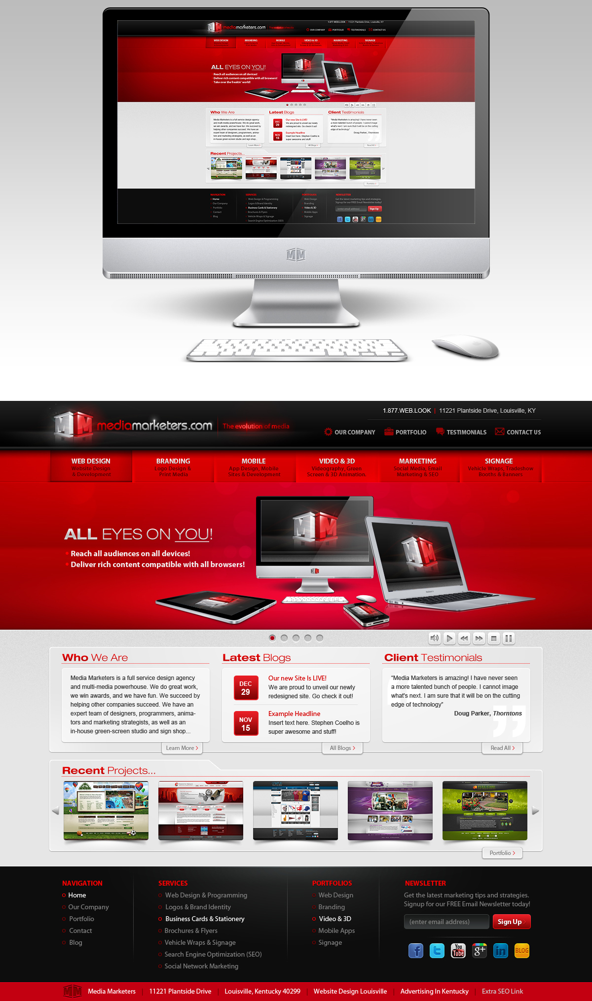
I was chosen amongst our design team to redesign our marketing firm's website.
Image size
1200x2030px 1.09 MB
© 2012 - 2024 Stephen-Coelho
Comments6
Join the community to add your comment. Already a deviant? Log In
Nice!